The charm of visual communication
Guest contribution by Carsten Bußhoff, pacproject GmbH
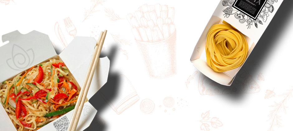
A prism on a black background, which splits a ray of light into the colours of a rainbow. Four men – one of them barefoot – walk in a row over a pedestrian crossing in London and a naked baby dives after a dollar note. These images, of course, describe milestones of music history – album covers, which also made history thanks to their artwork. But this was not just a matter of course. Up until the 40ies of the past century, shopping was quite a bleak endeavour for music aficionados. For instead of icons of popular culture, shelves were filled with grey protective sleeves for vinyl records. In 1938, however, one idea changed everything: The printed album cover!
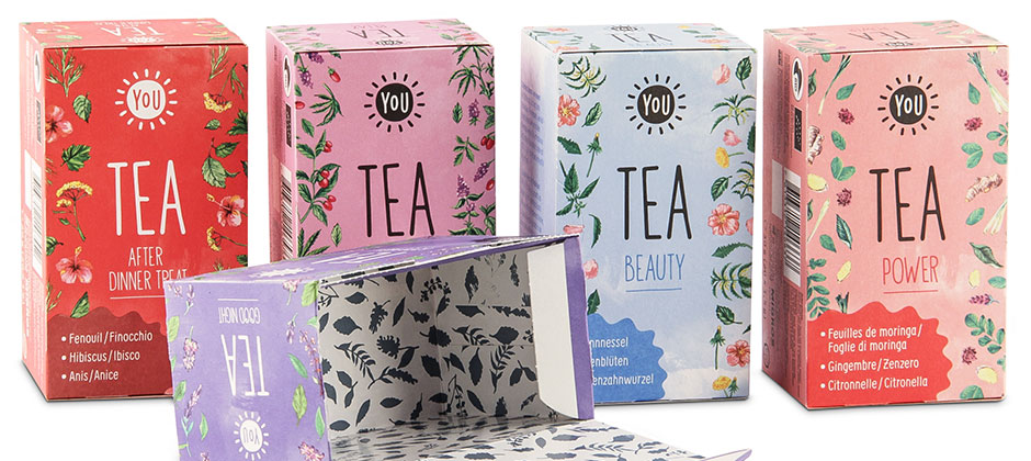
The package design increases the attractiveness of the product, provides orientation in product lines and influences purchase decision-making.
Thus, the first printed version of Beethovens “Eroica” made sales rise by a sensational 895 %. This example impressively demonstrates how much potential a product, its design and its printing can unfold together. Especially today, it is getting ever more important for products and their brands to communicate a message through its packaging. Today’s consumer is looking more and more for (brand-)experiences and seduction.
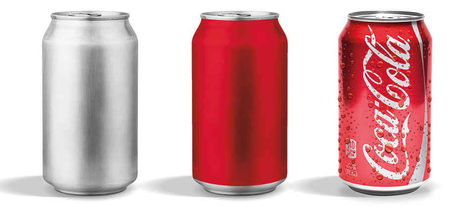
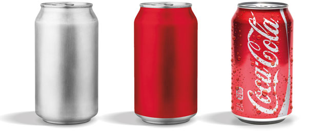
This means that packaging has been promoted to being the mouthpiece of the respective brand. Colours, as the most elementary form of communication, are playing an increasing role in this. “The most tender temptation since chocolate was invented” would be unimaginable without the smooth purple, which carries us into magical worlds or the deep blue, which has given us trust in our moisturising cream for generations.
And so, today more than ever: we must show our colours! Because only the combination of packaging, its design and print can make it possible to enchant the consumer and make the purchase an emotional experience.